



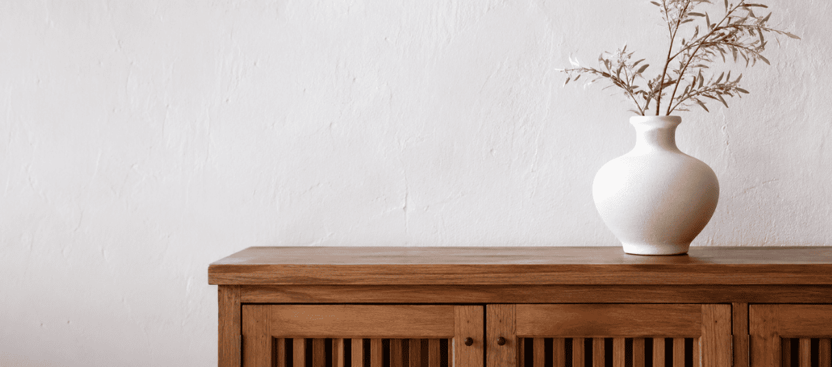
Before visibly noticing furniture or décor, the room itself has already impressed on our subconscious. The human brain immediately responds to colour, texture, light and proportion. Certain environments cause tension, overstimulation, or emotional fatigue without you fully understanding the reason. Designers, architects, and homeowners pay great attention to interior design’s influence on emotional wellbeing, concentration, relaxation, social interaction, and even physical comfort.
In recent years, many homeowners and designers have shifted away from highly polished interiors to favour spaces inspired by organic life. Stone surfaces remain textured rather than perfectly smoothed out. Limewashed walls are replacing high-gloss finishes. Linen, oak, clay, wool and travertine are favoured for their soft appearance. Researchers often refer to this as biophilic design, which is the idea that humans respond positively to environments that mirror patterns, materials, textures, and colours found in nature.
Colour in Interior Design
Certain tones are linked to feelings of relaxation, warmth, alertness, or safety across multiple cultures and architectural traditions. Others influence spatial perception and subtly change how large, intimate, or enclosed a room appears. Research in environmental psychology has shown that colour can affect heart rate, attention levels, perceived temperature, emotional comfort, spatial awareness and cognitive fatigue.
However, colour psychology works cumulatively through prolonged exposure. A space does not immediately feel stressful, but over time, highly saturated colours, excessive contrast, or visually cold materials can contribute to subtle sensory fatigue, and in the same way, not all blue rooms are automatically soothing.
How the Brain Interprets Colour
– Greens symbolise vegetation and biological life.
– Blues invoke a sense of calm, as clear skies, wide oceans and open distance do.
– Earthy tones mirror soil, stone, sand, timber, and organic landscapes.
– Warm amber light resembles firelight and sunset, conditions associated with safety and rest.
Earth-inspired tones generally create lower visual tension. Highly saturated colours demand more neurological attention because they contain greater visual intensity. Muted tones, by contrast, allow the eye to relax across surfaces. Warm tones such as terracotta, sand, ochre, caramel and soft browns often create feelings of enclosure, intimacy, and warmth. Cool tones such as charcoal, cool white, slate and certain muted greens can make a space feel relaxed and spacious, but also potentially distant if overused without balancing textures. A cool grey concrete wall paired with linen, oak, and soft natural light feels profoundly different from the same colour combined with reflective synthetic finishes and harsh lighting.
Warm & Cold Palettes
People sometimes describe modern interiors as clinical or cold because of excessive visual uniformity, flat colours or reflective surfaces. Stone contains irregularity. Timber ages. Linen folds unevenly. These subtle imperfections create sensory richness that synthetic uniformity lacks. This distinction becomes especially important in contemporary interiors where colour palettes are often minimal.
Warm palettes generally draw inspiration from earthy elements. Shades of clay, sandstone, terracotta, caramel, tobacco, muted ochre, and warm taupe tend to feel grounded and enveloping. These tones absorb light, which contributes to the comfort and intimacy within a room.
Cool palettes are closely associated with water, shadow, stone, mist, and sky. Soft blue-greys, charcoal tones, slate hues, cool whites, and muted mineral colours often create interiors that feel spacious and serene.
Homes with large glass expanses, polished concrete, steel detailing, and minimal decor often require warmth in small detail. Designers achieve this through subtle tonal layering rather than a dramatic colour contrast. A cool architectural shell may be softened with oak flooring, linen upholstery, plaster walls, or warm ambient lighting. This mirrors nature itself, which is why balanced palettes often feel so comfortable within the home.
Texture in Interior Design
Colour often receives most of the attention when people begin designing a home, however, texture determines whether a space feels inviting, sophisticated, comfortable, or flat. Texture adds visual depth and prevents a room from feeling one-dimensional, even when the colour palette is relatively simple.
A smooth stone countertop becomes interesting when paired with natural timber cabinetry. Even something as simple as combining matte and reflective surfaces can create visual richness without overwhelming the room.
One of the most effective ways to create depth within a room is through layering. This does not mean filling a space with objects. Rather, it involves introducing subtle differences in material, finish and scale that create visual interest without clutter. Imagine a living room designed around a neutral palette. Without variation, the space will appear flat despite its elegance. By introducing upholstery, a fibre rug, a timber coffee table, and soft curtains, the room gains dimension without being visually busy. Furniture placement also contributes to the emotional experience when arranged to encourage conversation and movement. Furniture positioned with intention creates flow, while excessive furniture often restricts it.
Living Rooms
Few spaces in the home are used as frequently or for as many purposes as the living room. It is where people gather, relax, entertain, and spend significant amounts of time. Colours that feel too energetic may become tiring over time, while overly muted spaces may lack warmth.
Soft neutrals, earthy tones, muted greens, warm greys, and timber finishes often work well because they create a calm backdrop while allowing furniture and artwork to provide personality. Natural light during the day should be complemented by soft ambient lighting in the evening.
Kitchens
Modern kitchens are not just for cooking, they also serve as gathering areas, informal dining rooms and everyday social hubs. Cabinets paired with timber accents or stone surfaces balance well. Areas that receive significant outdoor light can accommodate slightly deeper tones, while darker areas may benefit from light surfaces that reflect light throughout the room.
Bedrooms
More than any other room, the bedroom benefits most from a sense of calm. Soft, layered colours and textiles are particularly important. Upholstered headboards, bedding fabrics, curtains, and rugs help soften the room both visually and physically.
Bathrooms
Natural stone, a tile finish, timber accents, and warm lighting can transform a bathroom from a practical necessity into a restorative retreat. Colour palettes that draw from nature, the seaside or rainforests work particularly well because they create a connection to water, stone, and landscape. Simplicity is effective, allowing materials to become the focal points.
Home Offices
For many households, the home office has evolved from an occasional workspace into a permanent part of daily life. The ideal home office balances focus and comfort. Colours that are too stimulating will become distracting, while spaces that lack interesting features can feel uninspiring. Natural light should be prioritised wherever possible. The goal is to design a workspace that supports concentration and connects to the rest of the home.
The most successful interiors are rarely the most elaborate. More often, they are the spaces that feel comfortable to spend time in, where colour, materials and light work together rather than competing for attention. When these elements are balanced well, a home becomes more than a collection of rooms. It supports the way people live, move, work and relax every day. And while styles and trends will continue, balance remains timeless.
To Nurture is Nature 🌿
🩵 Instagram: @chateauhomeandpetcare
🩵 Facebook: chateauhomeandpetcare